Landyachtz Logos
Brand identity and imagery are critical factors influencing skateboard sales. Since 1997, Landyachtz has grown to become a global leader in the downhill, freeride, cruiser, and dancer skateboard categories. As these disciplines gained momentum over the years, a lot of new players emerged in the market. It became essential for the Landyachtz visual brand to evolve in order to attract new skaters, retain its loyal fans, and remain synonymous with high quality products that deliver the absolute best riding experience.

Coming Soon
This case study is still a work in progress.

Strategy
With the desire to adapt and grow along with the culture of skateboarding, Landyachtz defied the notion that a single logo or wordmark was essential for brand success. Instead, we focused our efforts on reaching a broad intersection of people, values, and culture that we consider potential customers. With this freedom, we were able to explore and produce logos, monograms, and wordmarks specific to products, people, and the the experiences they would have together. Our logos are designed to act as signatures. They are emblems that represent the values of Landyachtz. They are designed to compliment and support the product, without asking for undue attention. We produced some truly awesome logos to accomplish these goals.


L-Star
The OG Landyachtz logo, also known around the office as the L-Star. Because the logo is weighted heavily to the right side, special care is required to ensure the placement looks centered. I’ve chosen not to do that for the logo above, in order to make a point.


Classic
This logo provides some balance to the L-Star by containing it within a rectangle. Designed by founder Tom Edstrand in the early 2000s and has been used pretty much everywhere forever.


Triangle
Designed by former Landyachtz Art Director Greg Nicholls, the triangle logo is an impactful and versatile emblem. Although the challenge of comprehending and retaining the company name is not improved with this design, the simplicity and neutral aesthetic makes it a suitable candidate for a variety of applications and it is still featured on our products today.
Wordmarks
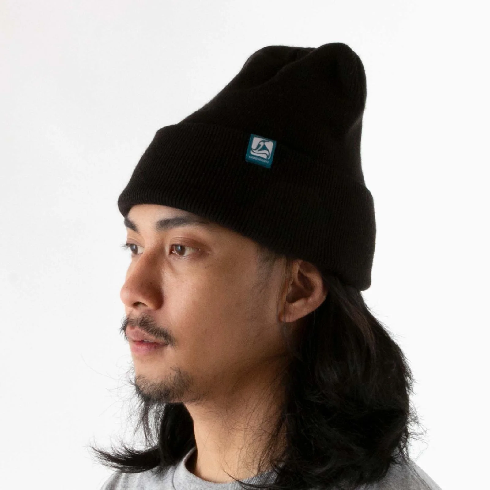
One of our biggest challenges as a company is the ability for customers to pronounce Landyachtz. If something can’t be read, it’s not easy to remember. We devised and implemented numerous strategies to improve the stickiness of our name with potential customers. Our first endeavor was to design a simple wordmark logo that increased readability by splitting the name into two more manageable words and placed them in a box with a lot of room.


Box
We began by creating a series of understated wordmarks that were readable at scale and compatible with our many graphic application processes. These wordmarks are prevalent throughout Landyachtz’ brand and product offering, appearing on print magazines, business cards, skateboards, apparel, social media, and as the logo of our website.


Bubble
Now that you know our name, you might as well shout it.
LY Monograms
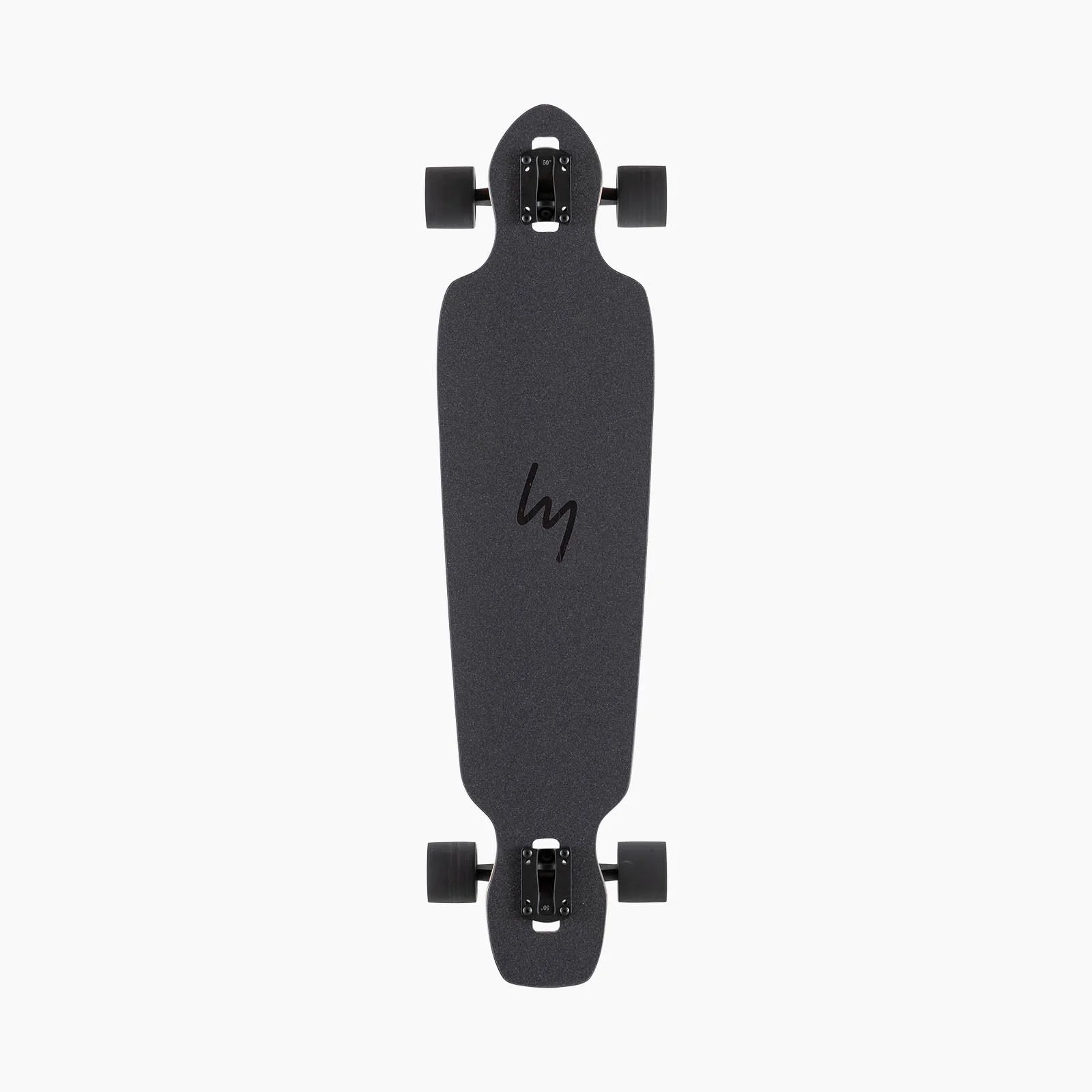
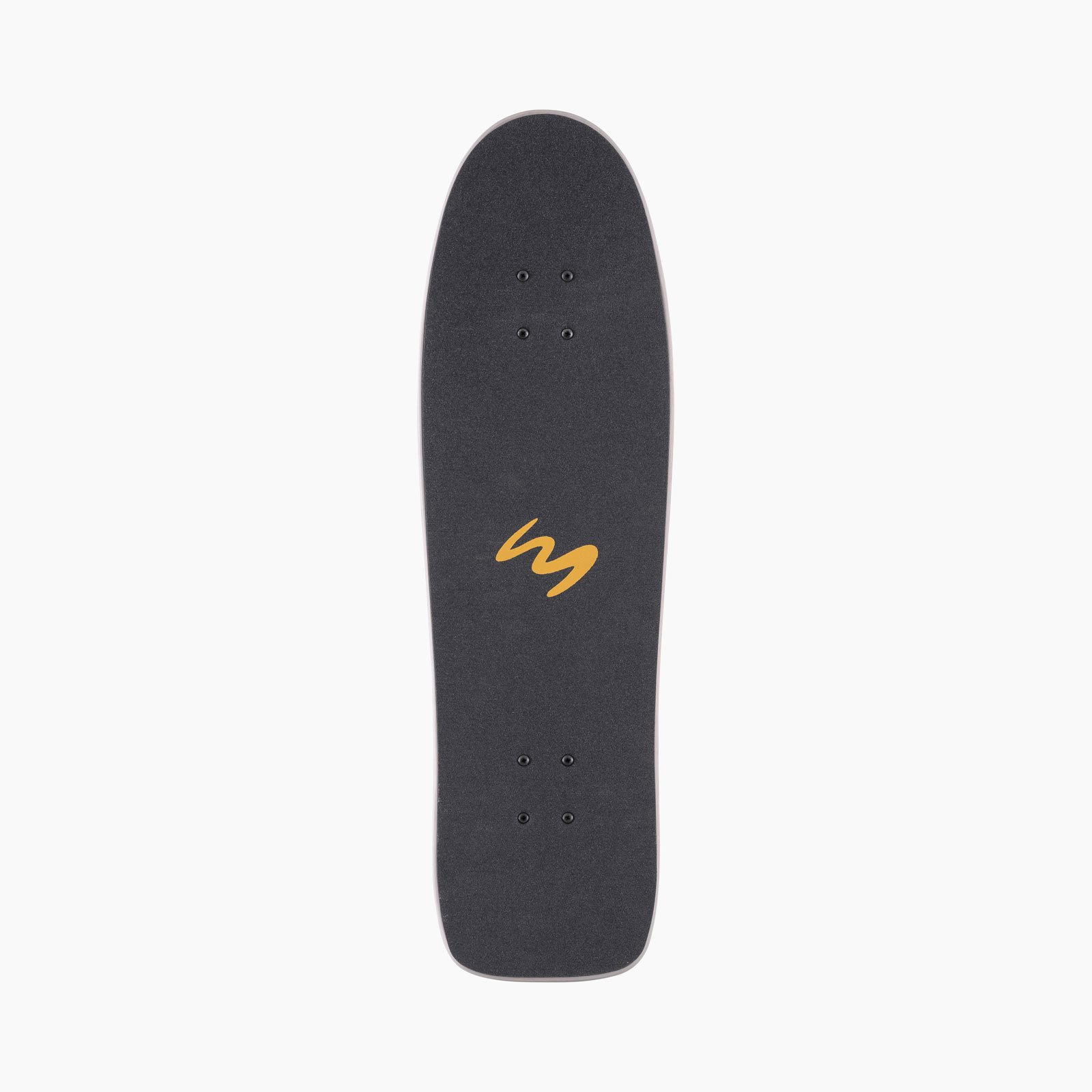
Another strategy that we employed was create a series of monograms that abbreviated Landyachtz down to the letters LY. This allowed us to reduce the complexity of our grip tape dye cuts, as well as to create simple graphics that were easily placed.


Thrashy
The smooth lines of the signature are used for


Stamp
This design closely groups the letters and evenly weights positive and negative space, resulting in a minimal logo that is ideal for our more low-key designs. We created solid knocked-out variations, versions with no outline, and we varied the level of detail, depending on the application.


Overlap
The smooth lines of the signature are used for
LY Logos
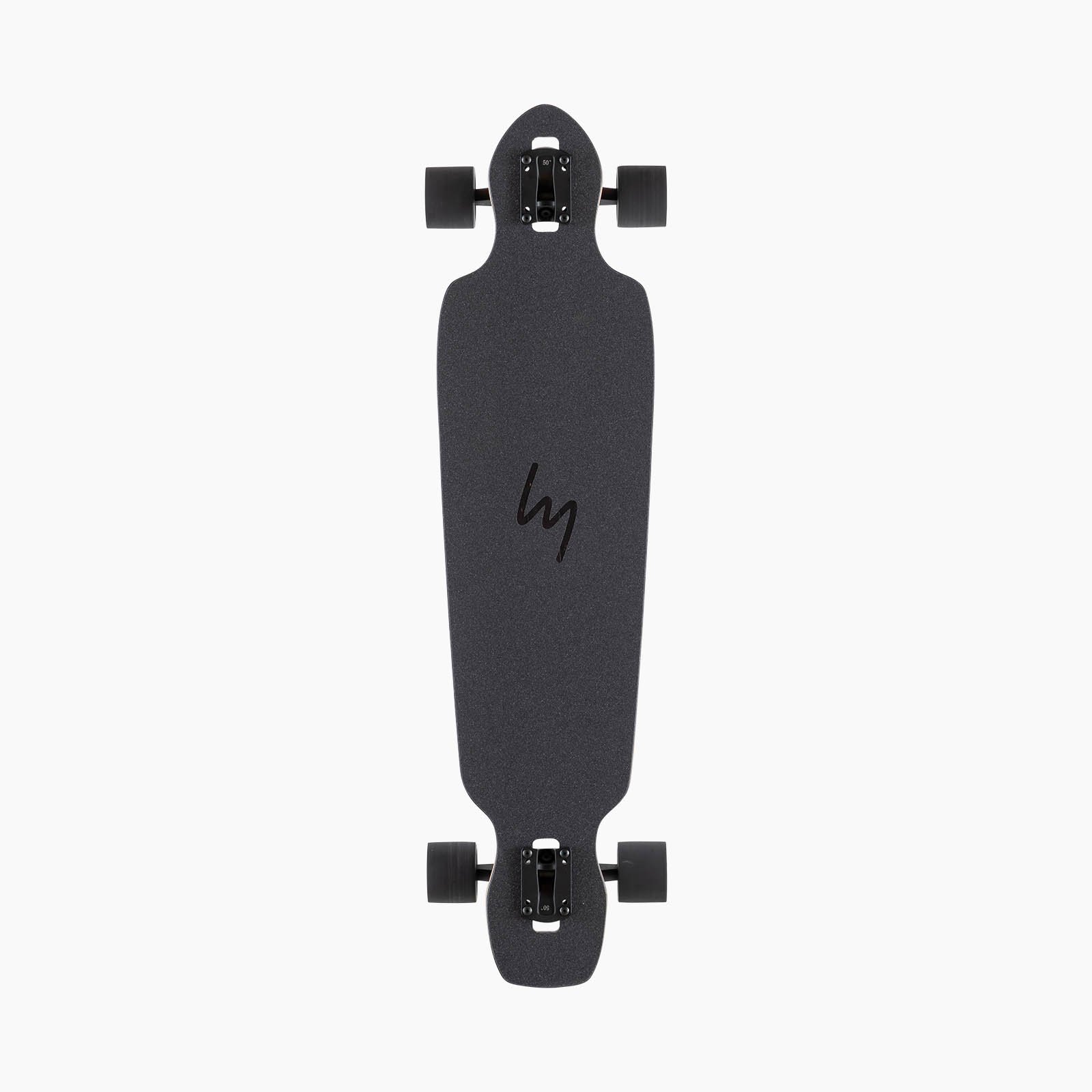
Another strategy that we employed was create a series of monograms that abbreviated Landyachtz down to the letters LY. We spent hundreds of hours exploring the relationship of these letters and filled quite a few sketchbooks with potential ideas. Through this process we discovered not only that LY is able to be written symmetrically, which has numerous advantages for placement on products, but when the letters are joined, they depict a flowing zig zag, reminiscent of the lines that we trace as we ride our boards.


Swoop
It was an incredibly fortunate discovery finding out that L and Y can be written in a way that depicts a winding path - the ideal environment for finding joy on a skateboard. This eureka moment opened the gates and released a wave of new logos that perfectly suited the feeling of freedom and flow that our products delivered.


Siggy
The smooth lines of the signature are used for


Squiggle
Thicker and more aggressive than the previous two, the squiggle was created for narrower boards. Thicker line is reminiscent of a wide-tip marker. This


Bolt
The smooth lines of the signature are used for


Brushed
The smooth lines of the signature are used for


Chicane
The smooth lines of the signature are used for


Ball
Is it a basketball? A baseball? A pool ball? Is it the Pepsi logo? Yes.


Skull
The smooth lines of the signature are used for
Artist Originals
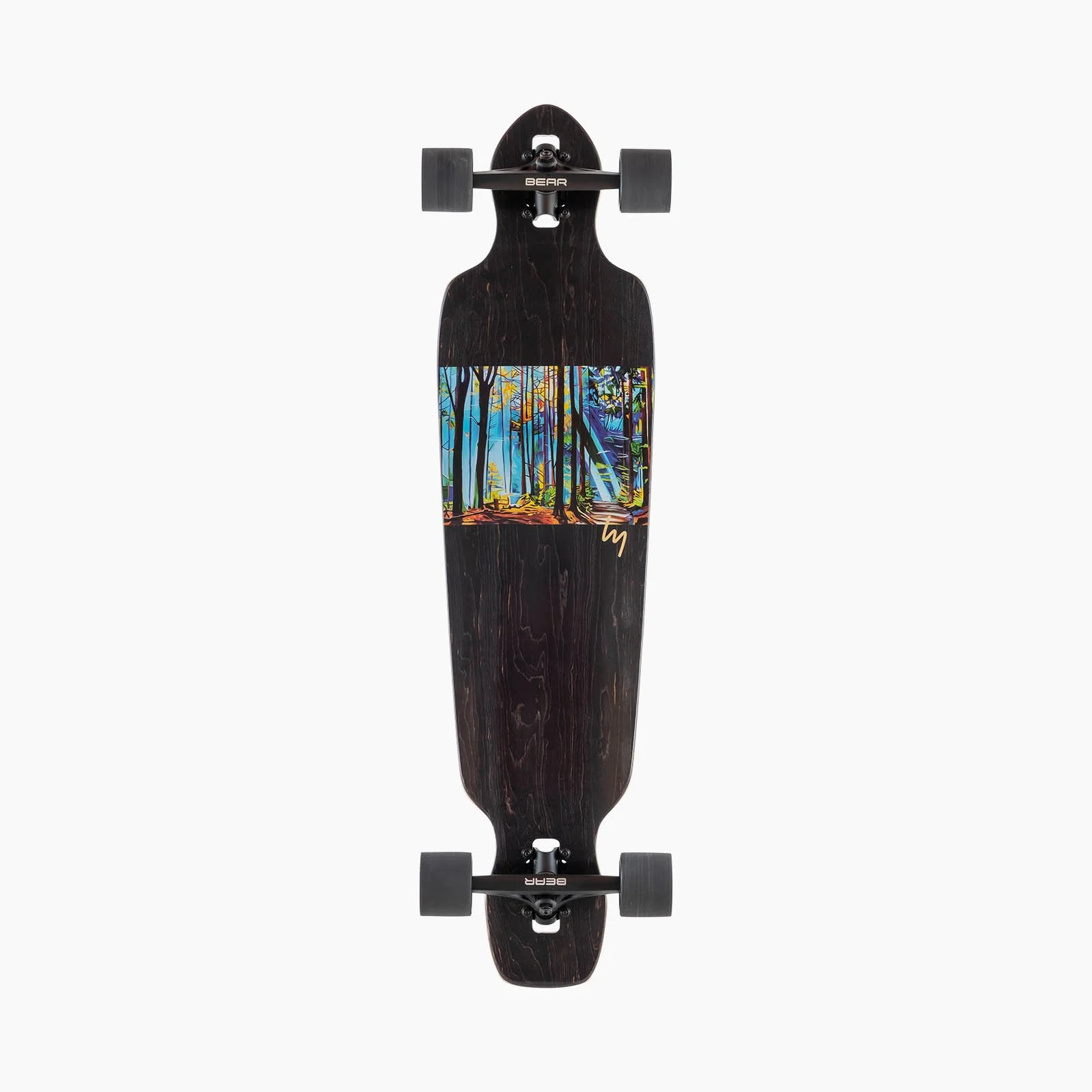
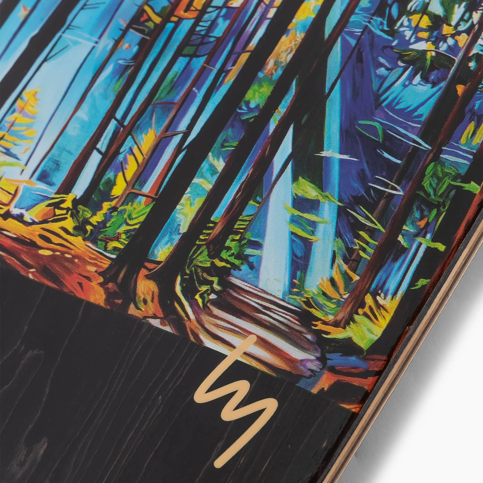
Whenever possible, we asked artists that we were collaborating with to create custom wordmarks for us to use with their art. Commissioned artwork comes with risk and the art didn’t always work out. But, these collaborations helped us improve our understanding and communication of what ingredients are required to make a wordmark that aligns with the Landyachtz’ brand.


Logos
Many of our skateboards are designed symmetrically, with tip and tail operating interchangeably. Something as simple as logo placement can imply directionality to our customers, suggesting that the product has a front and a back. For this reason, a symmetrical logo or wordmark has always been something of a unicorn for us. Making Landyachtz read the same forward and backwards is not a small challenge. I found success by further exploring the relationship between the letters L and Y. Through countless hours of doodling, I eventually developed a system that unlocked a world of logo possibilities, many of which allowed for LY to be read in both directions.
Symmetry
Some of our products are symmetrical. We a logo that would still represent Landyachtz, but preserve the symmetry of the board. It took many hours of doodling, but I eventually found a way to write LY symmetrically, allowing us to place the logo directly in the middle of the board. God this felt good. I had a design orgasm.
Does it Apply?
Our wordmarks, monograms and logos are applied to hundreds of products annually, each with unique requirements and limitations. By developing a large library of branding assets, we have the flexibility to choose which assets to use, based on our selection criteria, as follows: Suits the personality of the product. Works for the graphic application process.